-
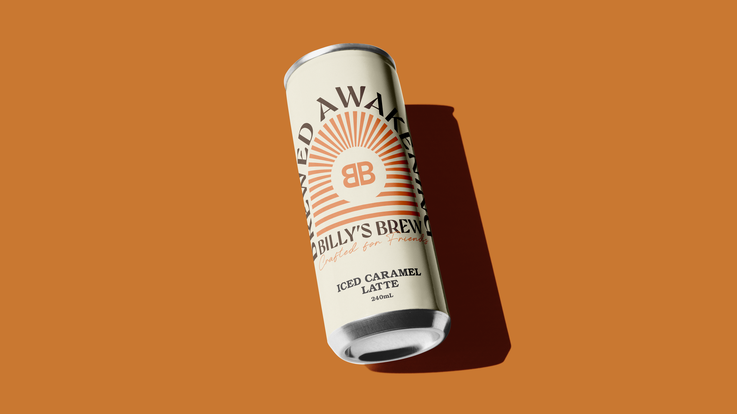
Billy’s Brew required a cold brew label concept that reflected the brand’s values of creativity, sustainability and community connection, with a visual direction inspired by the relaxed energy of Byron Bay.
-
Developing a label that felt both contemporary and grounded, minimalist typography with a warm, authentic personality that would stand out on shelf.
-
The final design presents a refined, community-focused typographic label that communicates Billy’s Brew’s story with clarity and character, highlighting my ability to craft branding that feels both intentional and culturally rooted.